
E. Rowell: I was skeptical as to whether I would learn anything more from this documentary because I already realized that global warming is a scam. But it is a compelling and serious clarion call to the people of the world to unite in the effort to end the death grip the parasitic elites have on our society. They have taken science and destroyed it. They have taken public health and medicine and damaged it beyond belief. They have taken our Bill of Rights and turned it to dust. But as long as we refuse to see ourselves as slaves they can never make us slaves.
By 2ND SMARTEST GUY IN THE WORLD 22 March 2024
PSYOP-CLIMATE-CHANGE: The Absurd CO2 Scam
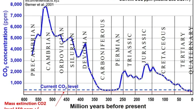
The above chart should, in a sane world, put an end to all “climate change” arguments. The current atmospheric CO2 level is around 420ppm, which is critically too low. We actually need more CO2, not less.
This documentary is MUST SEE:
Now that the PSYOP-19 “pandemic” has lost its grip on much of the world, the technocratic powers that be are betting on PSYOP-CLIMATE-CHANGE to scare enough genetically modified humans into a permanent global ”climate” lockdown.


MIkey-
Are you sure you don’t mean 200 MILLION years ago for the Jurassic Age,, not 200,000.
Are you sure you’re sure…………??
Because you have humans living during the times of the great dinosaurs, like in some C grade movies
THAT take a lot of faith …………..!!!
If yoo explained THIS on Israpundit before, it’s likely the reason why no one paid any attention to it.
Michael
Thanks for tackling this but your dates wrong re Jurassic
My big criticism is all this is in its distortion of the work of climate scientists
Really clever devoted scientists that are the very people whose work has CREATED THIS CHART in the first place
I remember explaining this on israpundit before
I think we should focus on Happer etc in the film
What is his claim anyway.
I am watching how others react.
Hi, Felix. Here’s a key to the graph:
On the graph, 200,000 years BP (before present) corresponds to the beginning of the Jurassic Age, when dinosaurs became dominant. Animals, like dinosaurs, breathe in oxygen and exhale CO2; so the Jurassic was a time of peak CO2 production. As these creatures died off, the CO2 level steadily declines, up to the present time. Human activity, therefore DECREASED CO2 levels — the exact opposite of the logic of the “green” movement.
A similar much larger peak occurred in the Cambrian period, when animal life forms suddenly appeared, and for the same reason.
If you create a chart like the above which covers 60 million years but present it in such a way that human beings are omitted that poses a screeching warning and that very deceitful things are underway.
All climate scientists are fully aware that the climate has always been in a state of change
But these changes happening over very long periods of time.
Isn’t this chart covering 60 million years
How do we have the information of this very long period?
From science. Science is responsible for this measurement.
So science has known what has happened in the past. The records of the past have built up because science has built them up, and they were all recorded.
But where on this chart is the emerging homo sapiens?
The chart cannot show.
So we have no way of talking about our present
And so the chart blocks us from knowledge of the present.
What’s the point of that? We live in the present.
Our future will be decided here in our present, so the chart is good, but as presented plays a trick on us.
Michael
Thanks for your words
Be my teacher and show me what is convincing about this chart. Explain in more detail what it means for us today?
That’s a pretty convincing graph. Felix, were you reading it upside-down?
We mmeasure it in every single way and wherever we look (and measure) the planetary heat runs out of control. The good times are over. Global warming will be our main preoccupation. Climate Change is simple.